
From Bali to the Bean: Lessons in the Art of Inclusive Retail Language
Why the words we choose should welcome customers in

Whether through written words, spoken phrases, or a store's design language, how we communicate shapes the customer experience. It’s like orchestrating a symphony where every element, from the sheen of the materials to the flow of the layout, right down to the navigational signs and packaging, must play in perfect harmony, especially when the goal is to be both accessible and inclusive. But this is no small feat—it’s a delicate balancing act, with various stakeholders each trying to ensure their part of the experience hits the right note.
This idea struck me during a recent trip to Bali, where I found myself enjoying a cup of Luwak coffee—brewed from beans that have passed through a civet cat, no less. In Bali, I noticed something refreshingly simple: while we in the West often complicate things to stand out, the locals kept it straightforward. ‘Drink this ginseng coffee to relieve stress and improve memory,’ or, ‘Try this coconut coffee to reduce hunger and boost alertness.’ There was an appealing directness to it—no need for elaborate descriptions or obscure flavour notes.
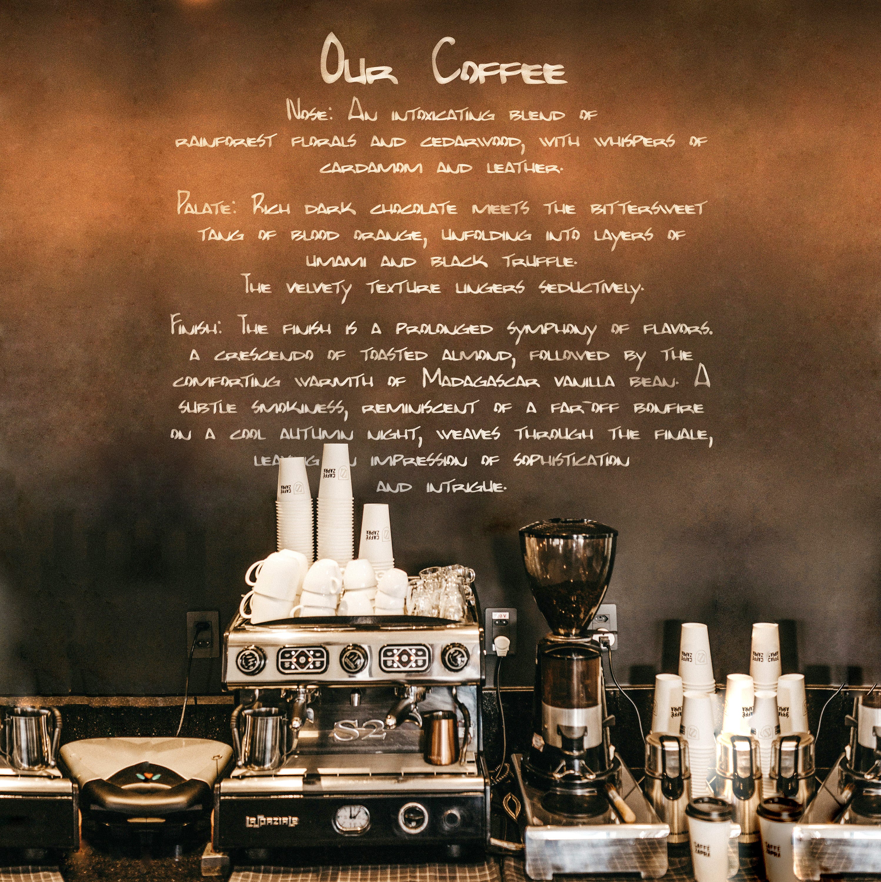
Back home, it’s a different story. Our coffee and wine often come wrapped in a language that’s more about sophistication than simplicity, with descriptions so abstract they might leave even a seasoned barista puzzled. ‘Hints of elderflower, a touch of caramel, a finish reminiscent of apricots.’ It’s all very poetic, but how many of us really taste those notes? For the average drinker, this kind of language can feel more alienating than engaging, creating a sense of exclusivity that might actually be off-putting.
Have we taken branded communication too far? When even ordering a simple coffee feels like navigating a linguistic minefield. At Starbucks, the universally understood ‘small, medium, large’ has been needlessly rebranded as Tall, Grande, and Venti. Is this differentiation for the sake of confusion, is it a charming, delightful bit of brand theatre or a maddening bit of branding that turns a basic request into an unnecessary challenge?
As retailers reimagine their physical spaces to be more inclusive, it’s not just the architecture that demands our attention. The language we use—whether subtly embedded in the design materials or boldly emblazoned on packaging must align to this vision. After all, a truly inclusive experience isn’t just about accommodating different needs physically; it’s about making sure everyone, from the connoisseur to the casual drinker, feels welcomed and understood. Sometimes, the simplest language, both in words and design, can be the most powerful.